I’m always interested in title sequences, which is why the Skip Intro button on Netflix really irks me. They play an important part in setting the tone of the show, and are placed for maximum impact. A good title sequence, done properly, will define a show indelibly.
I like the title sequence for Newsradio for several reasons. The music is a great earworm, and the vibrancy of the season one to three titles inject a pace and vitality to the show. I even like the overlaid sounds of New York.
To me, it feels a bit different to other sequences of the time, which is perfect for the show.
Come season four, things changed – neither for the better nor the good – just in an interesting way.
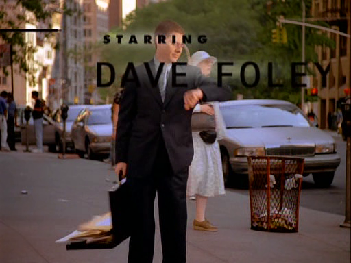
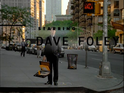
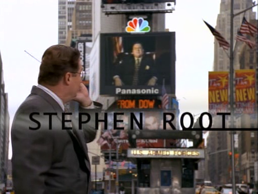
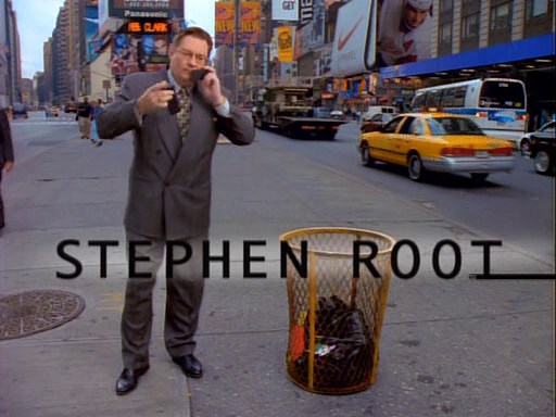
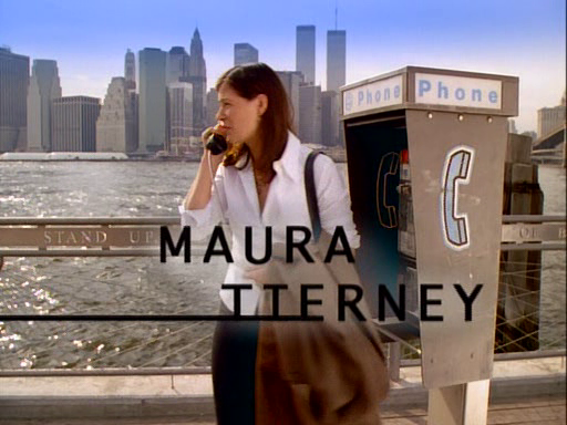
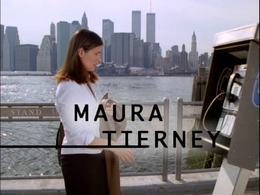
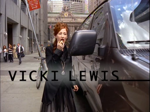
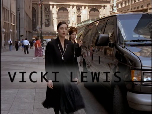
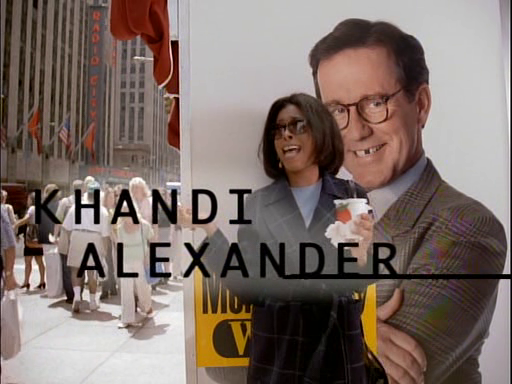
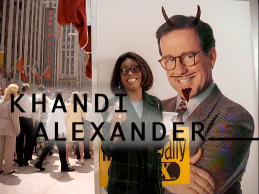
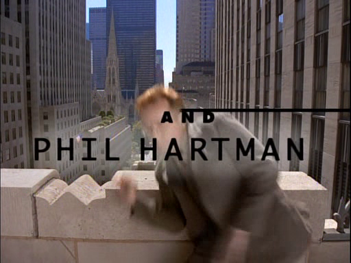
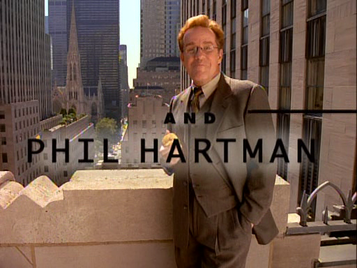
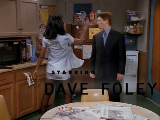
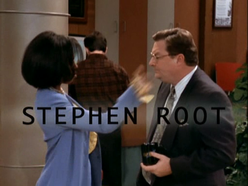
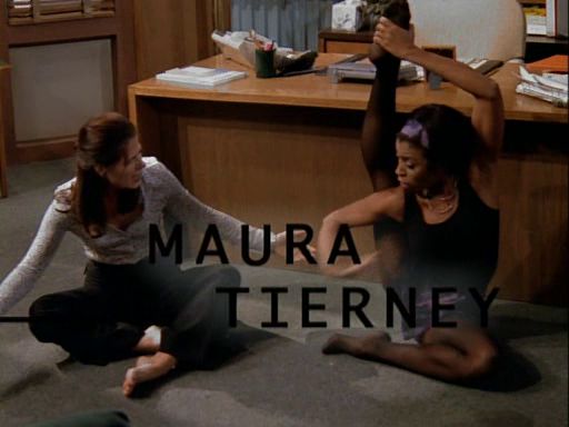
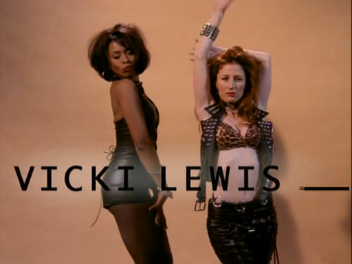
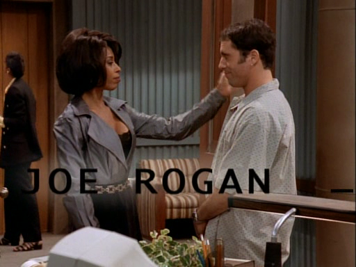
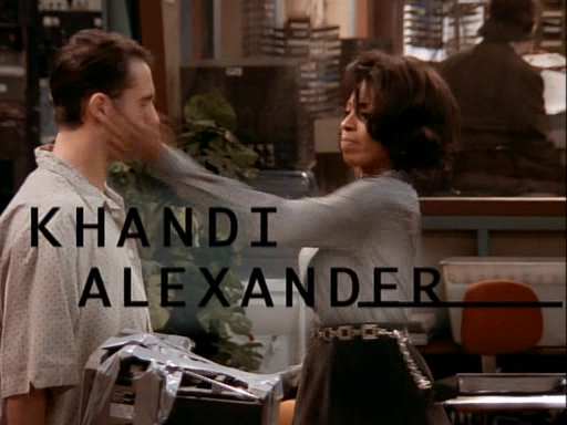
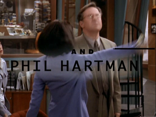
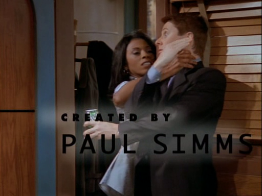
The cast were shown on screen in various vignettes.
This is 1997, and the green screen work on these shots is mostly really good. At the very least, they’ve been shot outside by the looks of it.
Interestingly though, these cast vignettes change, with the characters doing something slightly different each time. I can’t think of another show that did this (correct me, I’m no doubt wrong), and it’s a nice little touch.
Here are some examples.
If I had a bit more time, I’d go through and count how many different variations there are for each character – but my guess is three or four.
Even more interestingly, the pattern breaks as soon as episode three. In this, a scene plays out with the credits rolling over the top – not like you would usually see in a show, silently (as in Newsradio’s own season five) – but with the music playing. Again, I can’t think of another example of something like this.
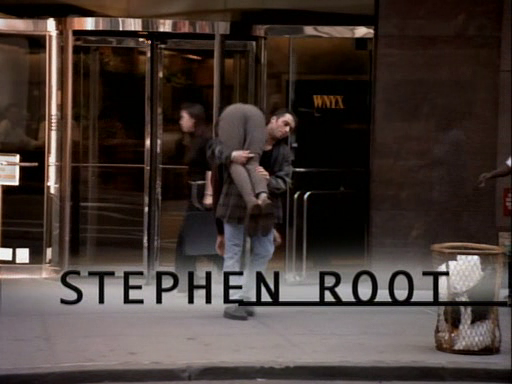
And again, by the time we get to the episode Catherine Moves On, a special sequence has been put together, which is a lovely touch.


