I’ve talked before about typography, and even appeared as a guest on The Z List Dead List talking about it. It got to the point that I noticed that the TV series Only Connect, for two episodes in a row, had taken inspiration for questions from the book Just My Type by Simon Garfield.
So how come I’ve only just noticed this?
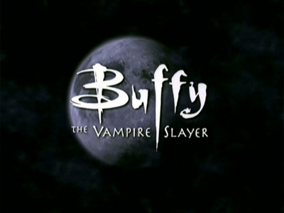
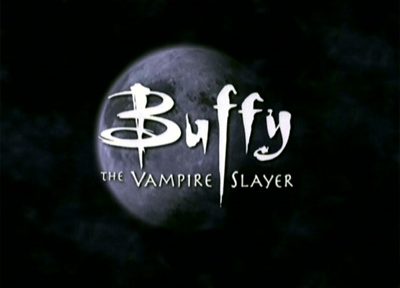
Aside from it being a great logo that captures the mix of genres in the show, and the eclectic mix of old and new, it has that F. That F, striking down through the logo like, well, like a Goddamned stake.
Here are some more factual tiddybitties about television typefaces.
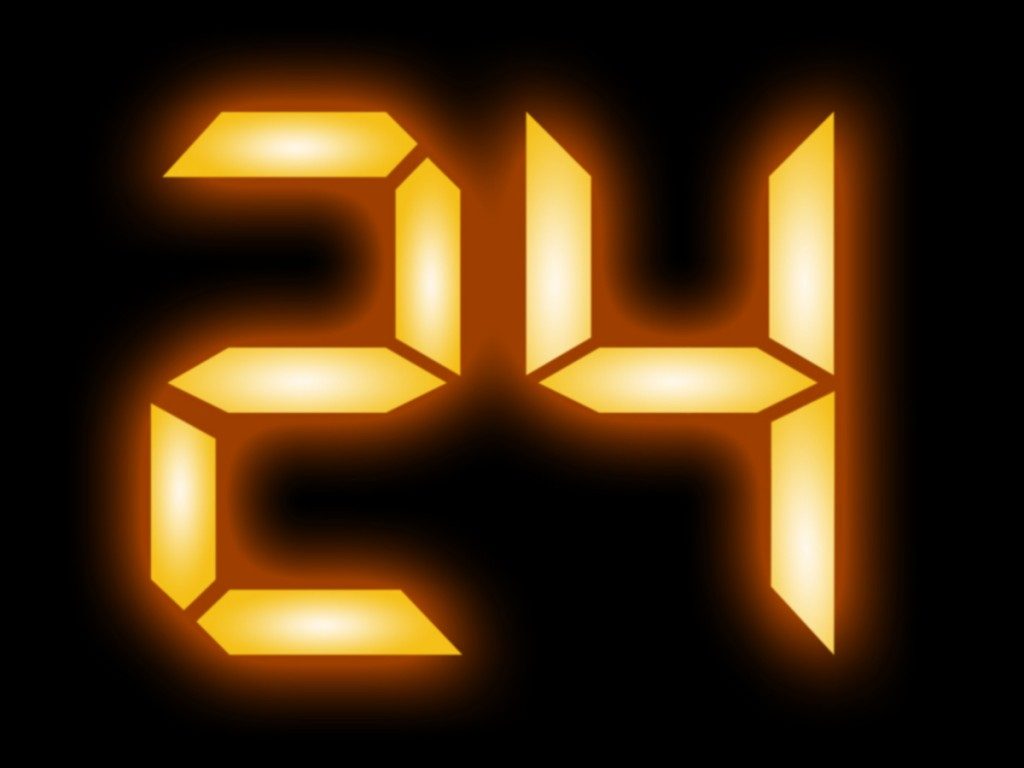
Look at it. It glows. It counts down. It sums up the show in a single two digit morsel, and makes you want to see Jack Bauer commit atrocious acts of torture. But did you know …? It’s got bad kerning. That’s the space a typeface designer leaves between each letter, but the ticking clock doesn’t allow enough space on the number 1 for another number to replace it, like a zero or a two. And so, apparently, the clock is never shown changing from a zero to a one, or a one to a two.
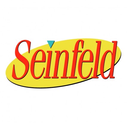
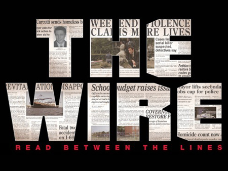
Shows like Seinfeld and The Wire use proprietary, or commissioned fonts for their logos. Seinfeld’s is kind of a horizontally scaled version of ITC Fenique Oblique, whereas The Wire changed up its design for the final season in order to represent it’s latest change of precinct.
What’s your favourite TV show/channel’s use of typography?
