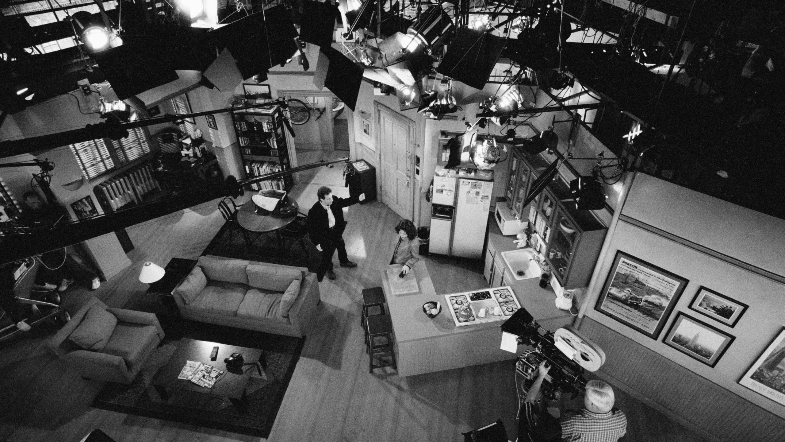
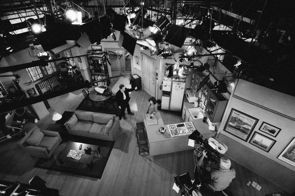
I’ve embarked on a little hobby project of making a scale model of the Seinfeld set. Luckily there are hours and hours of screen references, and plenty of behind the scenes photos. So, for instance, I’ve learned that the fridge is an Amana Automatic 25, and that it doesn’t techincally fit into the kitchen.
This is the most useful photo I’ve been using so far.
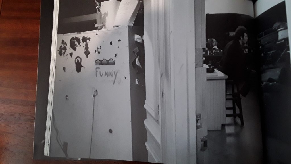
As you can see, the fridge has a hole cut into the wall, so it can be pushed back to make more space in the kitchen. Thus, the back of it sticks out into the hallway beyond. You can see this in the excellent book Sein Off by David Hume Kennerly.
The whole set is quite unusual in TV terms. Think of most US three camera sitcom sets, and the action tends to go left to right across the screen. The cast of Friends is rarely seen at the rear of the set. Seinfeld though, tries better to emulate the dinky apartment, and solves this by squashing the set, and staging the action in depth. The door is so oriented because so many entrances are made from it, and for the same reason the kitchen is built around the focal point of the corner of the counter and the fridge.
Most TV sets are designed as three-wall ones, but the apartment is a rather clever subversion of a two-wall setup.
The floorboards and the middle third of the set run perpendicular to the camera, and that’s also the deepest part of the set, running all the way back into the bathroom (that window in the bathroom probably looks right into Kramer’s apartment). Either side of that, each third splays out, allowing more space, and giving more to the camera. The only real dead space in the whole set is between the armchair and the screen left wall – and this is often where a camera will be placed. Even the nook with the desk and computer, and window (and air conditioner) can be shot with relative ease.
On the overhead photo above, you can see the barely glimpsed wall beyond the kitchen counter too, featuring some great photos and prints.
