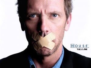
I’ve just started watching Season Six of House, and the opening sequence of the first episode is an excellent example of telling story through visuals. If you can show it rather than have a character explain it, it’s so much better for the viewer/reader.
I have three examples of terrible dialogue stuck in my head, and I need to exorcise them. The first one is almost forgiveable. It’s from the film Flightplan, and is a looped line added in post to explain a plot point we should already know. Towards the end of the film, Jodie Foster is walking through an airport with her daughter. The dubbed line is “Is that the lady with the girl?”
It literally serves no purpose, and should not be there.
But it’s not as bad as the moment in Clash Of The Titans I saw at the weekend. In summary:
Three more, even bigger scorpions appear on the horizon.
“There’s three more of them,” someone declares, “And they’re even bigger.
At what point in the re-writing of the script did someone read the stage direction and think it needed to be explained. It’s like Han Solo flying away from a destroyed space station screaming “Yayyy, we just blew up the Death Star.”
If you can cut even a single word of dialogue, you should. The line “I’m going to bed,” is less elegant than “Going to bed,” which also sounds more natural. If you can remove a word from a sentence without changing its meaning, do so.
Obviously there will be times when you can’t get through your exposition visually, and this is where you need to be subtle with your dialogue. The best and worst example of this came within a single line of one another on the show Lie To Me. Tim Roth’s charcter meets a woman we do not know and says something to her. She replies, “Not unless you want to marry me again.”
Before adding, “Because I’m your ex-wife.”
That is a lovely piece of expositionary dialogue completely shat upon by a terrible one.
I suspect it was a note from an executive.
